Wednesday, April 30, 2025

Speech Bubble Sketches

 Here are a few rough sketches I made while planning the panel layout for my comic project. These early drafts help me experiment with pacing, dialogue flow, and visual storytelling before moving on to detailed illustrations.


This page includes two small frames, most likely used for a subtle character introduction. I wanted to create a calm, distant feeling – a moment of silence before the story unfolds.
Here, the page is divided into two sections. The top panel has a shaded background with a speech bubble, suggesting a tense or serious tone. In the lower panel, another voice responds, indicating that a conversation is starting to build.
This layout includes one speech bubble above and a visual emphasis below (represented by an explosive or sharp shape). This might be a sound effect or a sudden reaction to the dialogue, helping to break the rhythm and draw attention.

In this layout, three speech bubbles overlap slightly, symbolizing an intense or fast-paced discussion. The aim is to portray a more dynamic and crowded verbal exchange.

Speech Bubble Ideas

I’ve been experimenting with different types of speech bubble placements and styles to use in my future comic pages. This concept page is a visual exploration of how speech bubbles can support storytelling through composition and mood.


In the first image, I tried out various bubble placements within panels. I focused on things like spacing between dialogues, tail directions, and how the bubbles interact with panel borders.


The second image shows different styles of speech bubbles depending on the type of communication:
• Normal speech
• Thought
• Whisper
• Burst/shouting
• Radio communication
• Telepathy


These forms will help me reflect different tones and emotions more effectively in upcoming scenes.


REFFERANCE 

speechbubble-example.png
 

https://www.vecteezy.com/vector-art/19900093-comic-book-page-divided-by-lines-with-speech-bubbles-rocket-superhero-and-sounds-effect-retro-background-mock-up-comics-template-vector-illustration


https://www.researchgate.net/figure/A-manga-page-panel-borders-green-example-lines-in-speech-bubbles-purple-free_fig1_385560014


The First Page prototype of The Elementals Comic

 These are the first ide of the page one in my comic


In these scenes, all of my characters are focused on and observing a conflict or event unfolding in the environment around them, directing their attention to understand and react to what's happening


This is the chat box on the first page where the characters are talking to each other. I’ve assigned numbers to them, as you can see, and each number matches a specific scene


This character is the boy of the family, and he has air powers. In this scene, a tornado forms around him, and he swears as the chaos unfolds.


This character is the mother of the family, and she has earth powers. As you can see, an earthquake is occurring in her area, and she is looking above the chaos, trying to assess the situation


This character is the father, and he controls the fire element. In his part of the scene, a volcano erupts, and he’s watching it, trying to understand what's happening. Like the others, he hasn't fully grasped the situation yet, but he can start to sense what's going on.


Tuesday, April 29, 2025

Artist Research - Nico Leon


Nico Leon is a comic book artist and illustrator from Argentina. He is best known for his work with Marvel Comics on series like Ms. Marvel, Spider-Man, Hulk, and Captain Marvel. His art style stands out because it’s expressive, clean, and full of energy. He brings life to every character he draws, making them feel real and relatable.


Nico mainly works on superhero comics. His drawings are a mix of dynamic action and emotional storytelling. He’s really good at showing facial expressions and body language, which makes the scenes more powerful. His panel layouts are creative, and he often plays with angles and composition to keep the reader engaged.


He works digitally using software like Clip Studio Paint and Photoshop. He starts with a digital sketch, adds clean lines, and finishes with strong colors and lighting. He often uses contrast and shadows to add depth, and his coloring style is soft but effective  it fits both quiet moments and intense fight scenes.

Nico Leon


I like how he balances action with emotion. His characters are not just cool-looking superheroes; they feel human. In Ms. Marvel, for example, you can really see the character’s personality through her expressions and posture. That inspires me in my own work  I want to make my characters feel alive like his do. 


marvel.fandom.com


References:

  •  Marvel.com. (2023). Nico Leon | Marvel. [online] Available at: https://www.marvel.com/comics/creators/13033/nico_leon [Accessed 28 April 2025].

  • to, C. (2024). Nico Leon. [online] DC Database. Available at: https://dc.fandom.com/wiki/Nico_Leon [Accessed 28 April 2025].

  • Leagueofcomicgeeks.com. (2015). Nico Leon - Comic Book Creator. [online] Available at: https://leagueofcomicgeeks.com/people/11268/nico-leon [Accessed 28 April 2025].


  • TAS VE CELIK

    Artist Research - Irene Koh

    Irene Koh is a comic artist and illustrator. She is most known for drawing The Legend of
    : Turf Wars
    comics. She has also worked on famous comics like Batgirl, Teen Titans, and TMNT. Irene is Korean-American and lives in the United States. She studied art and storytelling, and she uses these skills in her drawings.


    Irene Koh’s art is clean and expressive. Her lines are smooth and clear. She is very good at showing emotions in her characters. The way she draws faces and body movements helps tell the story, even without a lot of text. She also uses soft colours, which makes her art feel calm but strong.
    She often draws themes like identity, change, and friendship. Her style mixes Western comics with Asian influences.


    I chose Irene Koh because I like how she draws powerful and emotional characters. For my Elementals project, I want to show the feelings and power of the characters — not just their attacks, but how they feel inside.
    Irene’s way of drawing people and their energy helps me think about how to design my own characters. Her use of soft colours and simple backgrounds is also something I want to try.


    Irene’s use of soft colors and simple backgrounds is something I’d like to try in my own work. She creates beautiful artwork without needing too much detail in the backgrounds, which makes the characters and their emotions stand out more. I think this approach will be helpful in my project, as I want the focus to be on the characters and their feelings rather than distracting details.


    Irene Koh’s work in the comic book world has had am She is an artist who understands the power of emotion in storytelling and the importance of connecting with readers through her characters. Her art makes her characters feel real, and it makes you care about what happens to them. This is something I want to achieve in my own work. Through Irene’s art, I’ve learned how important it is to show both the external actions and the internal feelings of a character. It’s not just about what they do, but about who they are inside.


    References:

    Fandom.com. (2025). Page Restricted. [online] Available at: https://avatar.fandom.com/wiki/Irene_Koh [Accessed 29 April 2025].


    DC. (2025). Irene Koh. [online] Available at: https://www.dc.com/talent/irene-koh [Accessed 29 April 2025].


    Darkhorse.com. (2017). The Legend of Korra: Turf Wars Part One TPB :: Profile :: Dark Horse Comics. [online] Available at: https://www.darkhorse.com/Books/29-495/The-Legend-of-Korra-Turf-Wars-Part-One-TPB [Accessed 29 April 2025].


    Wednesday, April 16, 2025

    Prototype Focus Group Feedback


    For today’s session, we did a focus group prototype feedback activity for Week 3, Session 3. I worked with my classmates Violeta, Marta, and Rania. At the end of this post,  


    This is the Audio Record of My Presentation: 


    The feedback I received from the group was very helpful. They told me which of my designs are clear and which ones need more work. Their comments helped me to understand how I can improve my ideas and make them easier to understand.


    One of the interesting suggestions they gave me was about the enemy characters. They told me that the enemies could be normal people who do not have superpowers. These people could hate the ones with powers and want to destroy them. I think this is a good idea because it adds more meaning and makes the story more interesting.


    They also suggested that I look at some films and series to get ideas and inspiration for my project. They recommended titles like The Incredibles, Invincible, Avatar, and The Legend of Korra. These examples can help me understand how to build strong characters and a clear visual style.


    This focus group session was very useful. I will focus on these suggestions and work on improving my project for the final version.


    Prototype Presenting


     There will be  questions about our projects prototype. Currently I have been finalizing the first two characters (Mother and Father), for the last characters I have to make daughter and son. For this presentaion we all recorded our talk, and mine will e on the bottom of this page (After I found out how to add). To prepare, I will be answering some questions, given to me by my tutor through the learning zone, regarding the prototypes I created. At the moment, I have created two prototypes of two different designs that I had come up with and I am currently creating my third one as well. I will also be posting the audio of my presentation towards the end of this post.


    *Does it work?*  

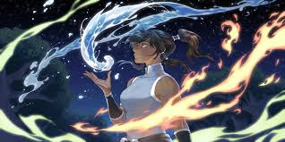
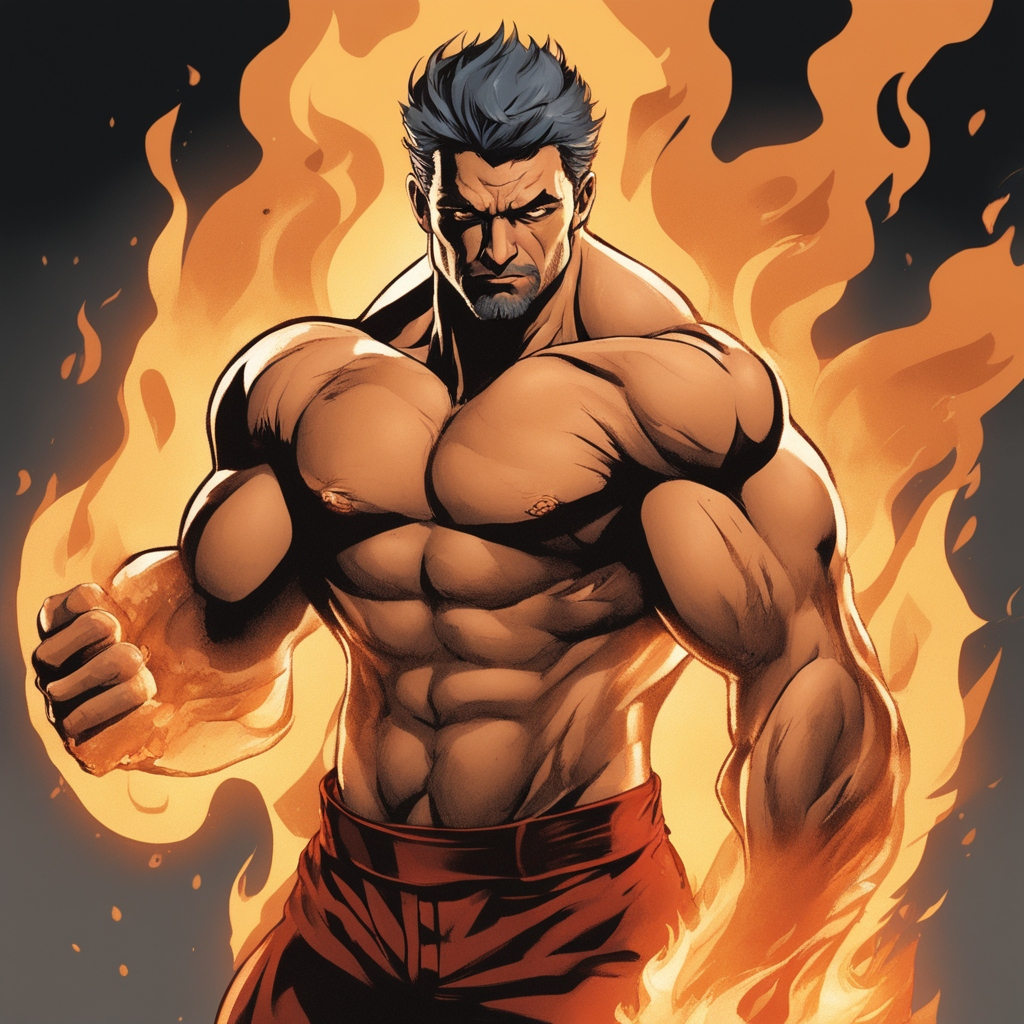
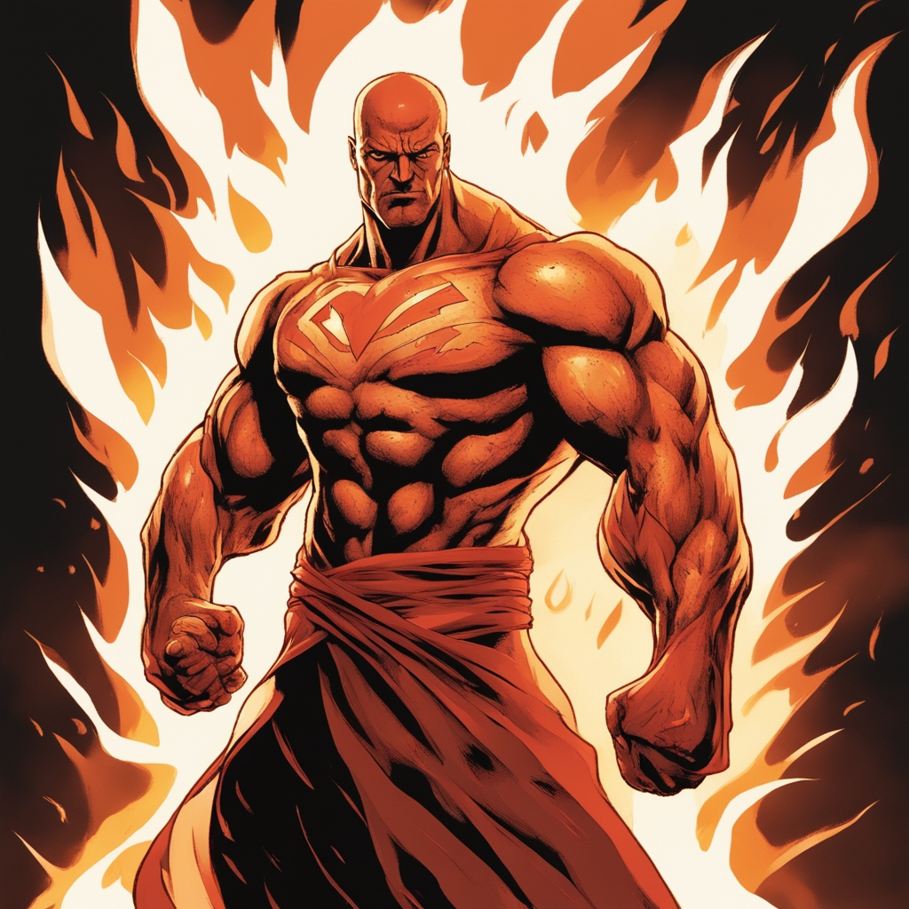
    I think my idea is working because the four characters show their elements very clearly. When people look at them, they can understand which element they belong to. For example, the fire character looks tough and dangerous, the earth one looks strong and feminine. This tells me the concept is clear, but I still need to make small changes to improve the designs.


    ---


    *Does it look as you hoped?*  

    Some designs look how I wanted, like the Earth and fire characters  their shapes and clothes show the element well. But I have to work on water and air characters. I want to fix that in the next version.


    ---


    *Is the design working as a whole?*  

    The characters work well as a group because they all follow the same art style and match each other. But the design can be better if I add more details to show their powers and personalities. I want the comic to tell their story even without words, so I will focus on this in my next sketches.


    ---


    *What was the process of making the design?*  

    First, I did research about the four elements and I made notes about what each element should look like. Then I started sketching different shapes and outfits for each character using pencils. After that, I chose the best sketches and cleaned them up. Now I am working on coloring and testing different poses for them.


    ---


    *How long did it take?*  

    Each character sketch took me about 2-3 hours, and the group composition took about 4 hours because I wanted the characters to look balanced together. I think the final comic will take more time. I haven't finish it all of them yet so with searching, sketching and creatign will take apprx 2-3 hours.


    ---


    *What materials/equipment will you need?*  

    For the sketches, I use pencils, markers, and paper. For the final design, I will use a drawing tablet and digital software like Photoshop or Clip Studio Paint. I also plan to print the comic, so I will need good quality paper later.


    ---


    *Have you sourced this?*  

    Yes, I already have the tablet and the software. I haven’t bought the paper or printing materials yet because I will do that after finishing the comic digitally.


    ---


    *What will it cost?*  

    The digital part is free for me because I already have the tools. Printing might cost around £10-£20, depending on size and paper quality.


    ---


    *Which design do you like best?*  

    I like the fire character the most because the design looks sharp, strong, and full of energy.


    ---


    *What would improve it?*  

    I think more research on character poses and body language will help me. I want to make sure each character shows their element clearly, not only by clothes but also by their expressions and poses.


    ---


    *These are the questions I prepared for the focus group:*  


    - Do you feel you have any gaps in your designs and how might you improve them?  

    - What materials are you going to use for your final outcomes?  

    - What kind of research do you think would be best for you to do in order to improve your design?  

    - How do you plan on creating your final outcomes? (digital, hand-drawn, printed, etc.)  

    - What has inspired your design so far and where do you see it going?  


    ---


    Monday, April 7, 2025

    Initial Visual Resarch

    This post I am going to start doing my visual research for the 4 Elements project. I am looking at different ways to explore the ideas of Fire, Water, Earth and Air. I am going to look at photos, drawings and objects from nature to help me to understand the feeling of each element. I also going to look at the artist and how they show these elements in their work. they say Earth: Represents solidity and stability. Air: Represents movement and change. Fire: Represents energy and transformation. Water: Represents fluidity and emotion. about the elements, and this gives me an start idea about it.
    I can use the effect and the pose of this character for my fire element
    This will be a pretty cool ide for the Water element, I liked the way he looks and the cape is a very genious ide to add a character I will definitly use that idea for my concept designs.

    Idea Development - AI images

    In today’s post, I will share the idea development I’ve been working on for my project. I used the AI-generated images and my initial sketches from previous posts to help me develop my ideas. These images and sketches are just a starting point, not my final designs. I plan to continue developing my ideas over the next week. 


     I printed some of the AI-generated images that I found interesting and thought could help me develop my characters.


     I picked these specific images because of their unique features. I really liked the details on the first character, especially their outfit and pose. The second character also caught my attention with their hairstyle and accessories and the last ones aura effect is absolutely amazing.


    For the Earth element I think that the mother will fit this character well because the word "Earth" resembles the life giving, birth and bright for me. I sued the manga style for this AI pictures and for the Fire element I used the superhero comic template.


    For the girl I thought the Water Element will emphasis well, or the Mother can be good but the Earth Element feels like more of an Mother figure can have so I decide to give water to the daughter.


    For the Air element I created this images with AI these are my top three favorite ones, I created 6 or 7 images just for the son of the family.
    the first one reminds me a show called INVINSIBLE, it looks like one of the characters from the show
                                                                   Vitrum Universe Mark

    The costume reminds me that, Ill go and look for the artist. I think this will be a better place to start getting ideas from it.


    Blog Completion - Final Reflection

     This year at DMUIC was hard for me. I tried to improve my drawing skills, especially with characters. I also worked on ideas for stories an...